

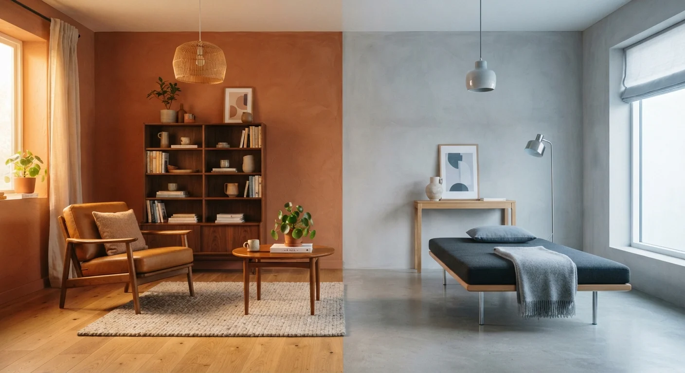
Our Verdict
Warm and cool palettes each bring distinct everyday experiences that go beyond visual preference. Warm tones create grounded, social, and cozy atmospheres that perform well in north-facing or frequently used gathering spaces. Cool tones promote focus, calm, and perceived spaciousness, making them well-suited to offices, bathrooms, and rooms with abundant natural light. Most successful interiors blend both - anchoring with one temperature and accenting with the other.
| Best for | Recommended |
|---|---|
| Living rooms, dining areas, and spaces used in the evening | Warm-toned palette |
| Home offices, bathrooms, and rooms with south- or east-facing windows | Cool-toned palette |
| Small rooms where spaciousness matters | Cool-toned palette |
| North-facing rooms that feel dark or cold regardless of season | Warm-toned palette |
What We Mean by Warm and Cool Tones
Color temperature in interior design refers to the underlying undertone of a hue rather than how light or dark it appears. Warm tones include reds, oranges, yellows, terra cotta, camel, cream, and any white or grey with a yellow, peach, or pink undertone. Cool tones include blues, blue-greens, lavenders, slate, and whites or greys with blue, green, or violet undertones.
This distinction matters because undertones interact with both artificial lighting and natural light in ways that shift throughout the day. A wall painted in a warm greige can look golden at dusk under incandescent bulbs but appear almost orange under certain LED temperatures. Understanding these dynamics is a core part of confident color decision-making - for a fuller foundation, see Color Theory for Living Spaces and the broader language of interior design.
How Each Palette Feels in Daily Life
The difference between warm and cool interiors is most noticeable not when you're standing still and admiring a room, but during the ordinary moments of daily life - morning coffee, late-night reading, a weekend afternoon on the couch.
Warm-Toned Spaces
Rooms anchored in warm tones tend to feel enveloping and socially inviting. Evening hours particularly favor warm palettes: under warm-spectrum lighting, terra cotta walls deepen pleasantly, wooden surfaces glow, and the room seems to close in just enough to feel intimate. This makes warm tones popular for dining rooms and living spaces where conversation and relaxation are the goals.
The trade-off appears in bright midday light, especially in south-facing rooms. Warm tones can feel heavy or overstimulating when combined with intense sunlight, and they can make already-small rooms feel even more compressed.
Cool-Toned Spaces
Cool palettes do their best work in daylight. A blue-grey bedroom feels crisp and calm in the morning, and a sage-green home office can reduce visual fatigue during long work sessions. Cool tones also tend to recede visually, making ceilings feel higher and walls feel farther apart - a genuine functional benefit in compact rooms.
After dark, however, cool tones can tip toward clinical or stark if lighting isn't managed carefully. A purely cool room under bright white LED light may feel more like a waiting room than a sanctuary. How you layer natural and artificial light plays a major role in preventing this.
| Warm-Toned Interiors | Cool-Toned Interiors | |
|---|---|---|
| Everyday mood | Cozy, intimate, energizing | Calm, airy, focused |
| Best time of day | Evening and night | Morning and daytime |
| Effect on perceived room size | Makes rooms feel smaller, cozier | Makes rooms feel larger, taller |
| Best window orientation | North-facing rooms | South- or east-facing rooms |
| Risk to watch for | Overwhelming in bright sunlight | Stark or cold under artificial light |
| Ideal room types | Dining rooms, living rooms, bedrooms | Home offices, bathrooms, studios |
| Winter performance | Feels welcoming during low-light months | Can feel cold without warm accent layers |
The Role of Light Direction and Season
One of the most overlooked factors in choosing between warm and cool palettes is the orientation of your windows. North-facing rooms receive indirect, bluish light throughout the day - they naturally read cooler and more shadowed. Applying a cool grey or blue in this context can make the room feel genuinely cold, even in summer. A warm white or muted amber can counteract that tendency without feeling heavy.
South-facing rooms get long hours of warm, direct light and can handle cooler palettes that might feel flat elsewhere. East-facing rooms receive warm morning light that shifts to neutral or cool by afternoon, while west-facing rooms experience the opposite: cooler mornings and rich, amber-tinted late-afternoon sun.
Test Paint Colors at Different Times of Day
Before committing to a wall color, paint large sample swatches - at least 12 by 12 inches - and observe them in the morning, midday, and evening under your typical lighting. A color that looks balanced at noon may read very differently once the sun moves or the lamps come on. This one step prevents most costly repainting decisions.
Season also affects this equation. In winter, a cool-toned room with grey walls and little natural light can amplify feelings of dreariness. A warm accent wall or warm-toned textiles - rugs, throws, cushions - can meaningfully shift the room's daily feel without a full repaint. If the overall room still feels off despite the palette, there may be other design factors at play.
Mixing Warm and Cool for a Balanced Interior
Most rooms benefit from both temperature ranges in different proportions. A useful starting approach is to choose one dominant temperature for large surfaces - walls, flooring, large upholstered pieces - and introduce the opposite temperature through accents, textiles, and smaller furniture.
For example, a room with warm oak floors and cream walls gains visual interest and sophistication from cool-toned art, steel or matte black fixtures, and blue or green accent cushions. Conversely, a cool-toned room with white walls and a concrete-look floor can feel warmer and more livable with natural wood shelving, linen curtains, or a rust-toned area rug.
When repainting to support a new palette direction, the finish you choose matters alongside the color itself - different paint finishes reflect light differently, which amplifies or softens color temperature. A satin finish on a warm wall will read differently from the same color in flat/matte.
90%
Of snap judgments about a space involve color
Research in environmental psychology consistently finds that color is among the first and most influential factors people process when entering a room.
~2,700K-3,000K
Bulb color temperature that complements warm interiors
Lighting designers generally recommend bulbs in the 2,700-3,000 Kelvin range for living areas to support warm-toned palettes and create an inviting ambiance.
The goal isn't to achieve a perfectly warm or perfectly cool room - it's to use color temperature intentionally so the space feels right for how it's actually used, and by whom, across the whole day.
The content on this site is for informational purposes only and is not a substitute for professional advice. Always consult a qualified professional for guidance specific to your situation.