

Why Decorating Myths Persist
Interior decorating advice travels fast - through social media, home renovation shows, and well-meaning friends - and often arrives stripped of the context that made it useful in the first place. A guideline that applies to one type of room, lighting condition, or furniture scale gets repeated as an absolute rule until it feels like gospel. The result: homeowners avoid choices that could genuinely improve their spaces, out of fear of breaking a rule that was never that firm to begin with.
Understanding why a piece of conventional wisdom exists is more valuable than memorizing it. Our guide to core interior design concepts breaks down the foundational vocabulary - scale, proportion, negative space - that helps you evaluate any decorating advice critically. Below, we address the myths that most reliably lead homeowners toward frustrating, expensive mistakes.
Myth
Dark colors make any room feel smaller and should be avoided in compact spaces.
Fact
Dark colors create depth and can make a room feel more intentional and cozy - their effect on perceived size depends heavily on lighting, ceiling height, and contrast, not color alone.
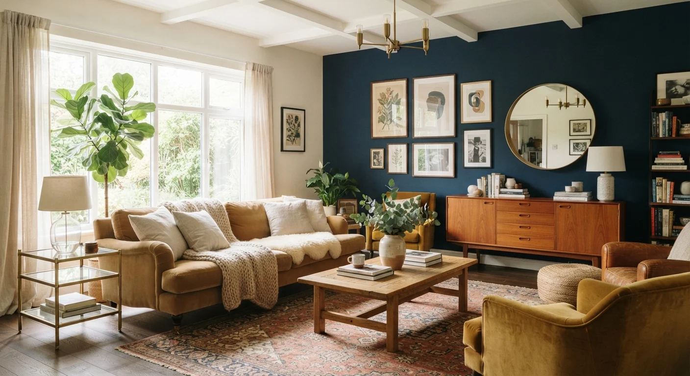
This rule emerged from a real principle - light reflects off pale walls and can make a room feel more open - but it was oversimplified into a prohibition. A deep charcoal or forest green on all four walls of a well-lit room with high ceilings can read as sophisticated and expansive rather than cave-like. Conversely, a small room painted off-white but stuffed with dark, heavy furniture and poor lighting will feel just as cramped. The variables that most affect perceived room size are natural light availability, ceiling height, and the scale of furnishings - not wall color alone. For a fuller explanation of how color interacts with light conditions, see our guide to natural and artificial lighting.
Myth
All furniture in a room should match - same finish, same style, same collection.
Fact
Matching furniture sets often produce flat, showroom-like results; deliberately mixing styles, finishes, and periods adds visual depth and personality.
Furniture matching as a decorating norm is partly a retail convenience - sets are easy to sell - rather than a design principle. Rooms that feel alive and personal almost always contain pieces from different sources and eras, unified by a shared element such as color palette, material, or visual weight rather than identical manufacture. The key is intentionality: mixing a mid-century sideboard with contemporary dining chairs works when there's a clear connective thread. Mixing without a unifying element is what leads to chaos, not mixing itself.
Myth
Small rooms need small furniture to avoid feeling crowded.
Fact
Oversized rooms of small-scale furniture can feel cluttered and unsettled; one or two well-chosen larger anchor pieces often make compact spaces feel more composed.
Filling a small room with many petite pieces - a loveseat instead of a sofa, a tiny coffee table, narrow shelves - creates visual noise without gaining usable space. A single well-proportioned sofa with clean lines and legs (which allow sightlines to the floor) will generally feel less intrusive than three mismatched small seats. Scale relative to the room matters, but the number of pieces and the visual weight of their design often matters more than their absolute dimensions. Anchoring furniture to a properly sized area rug also helps define the space without shrinking it.
Myth
An accent wall is the best way to bring color or pattern into a room.
Fact
Accent walls can work well, but they are one of several equally valid approaches; in many rooms, painting all four walls or using color through textiles and furniture is more cohesive.
The accent wall became a popular shortcut for introducing color without committing to a full-room repaint - a reasonable practical consideration, but not a design rule. In some rooms, a single contrasting wall can look deliberate and striking; in others, it appears arbitrary and unfinished. Rooms with complex layouts, multiple doorways, or strong architectural features often read better with consistent wall color throughout. Similarly, layering color through upholstery, cushions, and art can distribute visual interest more evenly than a single painted wall. The best approach depends on the room's architecture and the effect you want to achieve.
Myth
Renters can't meaningfully decorate because they can't paint or make permanent changes.
Fact
A wide range of reversible interventions - removable wallpaper, peel-and-stick tiles, gallery-wall systems, and strategic furniture arrangement - can transform a rental meaningfully.
The assumption that decorating requires permanent alterations leads many renters to live in spaces that feel generic and uninspiring for years. In practice, furniture placement alone dramatically changes how a room functions and feels. Temporary wallcoverings, removable adhesive hooks, curtain rods that use tension or pressure (no drilling required), and large area rugs can all be installed and removed without affecting walls or floors. Our rental decorating guide covers specific approaches that won't jeopardize a security deposit.
Putting the Corrections to Work
Debunking a myth is only useful if you can act on the correction. Here's how the facts above translate into practical decisions:
- Choosing wall color: Before ruling out a deep hue, paint a large sample swatch and observe it at different times of day. Lighting - both natural and artificial - will shift your perception dramatically. For a deeper dive, our practical color theory guide explains how hue and saturation interact with room conditions.
- Furnishing a small space: A single substantial sofa anchored by a properly sized rug will usually feel less cramped than several small pieces scattered without clear arrangement. See our small apartment decorating guide for layout strategies that work in tight footprints.
- Mixing furniture: Vary wood tones and upholstery textures deliberately - choose a unifying element like a repeated color or material to keep mixed pieces cohesive rather than chaotic.
- Window treatments: Hanging curtains close to the ceiling (rather than just above the window frame) adds visual height regardless of wall color. Our curtains vs. blinds comparison walks through how treatment choices affect both light and perceived room size.
77%
Homeowners who repaint within 2 years of a remodel
According to surveys by the National Association of Realtors, a significant majority of homeowners who complete interior renovations make color changes shortly after - often because initial choices were guided by overly cautious rules.
1 in 3
Rooms where rug size is cited as the main design error
Interior designers frequently identify undersized area rugs - a byproduct of the 'small room, small rug' myth - as among the most common and correctable decorating mistakes in US homes.
When a room still feels off despite following sound principles, the culprit is often a subtler issue - mismatched scale, poor traffic flow, or unbalanced lighting. Our article on why rooms feel 'off' can help you diagnose the problem systematically.
Don't Let 'Rules' Override Your Budget or Lifestyle
Decorating guidance - including corrections to myths - describes what tends to work visually, not what you must do. A design choice that strains your budget, conflicts with how you actually live in your home, or requires constant maintenance to maintain is not worth pursuing for the sake of principle. Always weigh aesthetics against function, cost, and how you genuinely use the space day-to-day.
The content on this site is for informational purposes only and is not a substitute for professional advice. Always consult a qualified professional for guidance specific to your situation.