

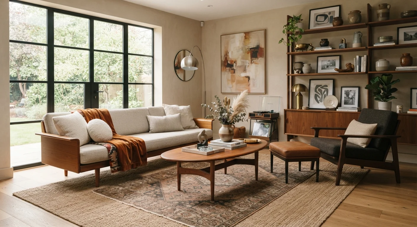
What Makes Eclectic Design Work - and What Makes It Fail
The difference between an eclectic room that feels curated and one that feels chaotic usually comes down to a single principle: every piece of contrast needs a counterweight. When a Victorian armchair sits next to a Scandinavian side table, something has to bridge the gap - a shared finish, a color that appears on both, or a textile that softens the transition between them.
Successful eclectic rooms are built on deliberate decisions, not accumulation. The most common failure mode is treating every vintage find as equally important. When everything competes for attention, nothing wins. Designers often call this 'visual noise' - a room where the eye can't rest because there's no hierarchy, no breathing room, and no consistent thread.
Think of it less like assembling a collection and more like composing a sentence: individual words (pieces) need grammar (underlying rules) to communicate clearly. Those rules - color, scale, material, and repetition - are what the rest of this article unpacks.
Eclecticism vs. Maximalism: A Key Distinction
Eclectic design is sometimes confused with maximalism, but they're not the same thing. Maximalism is characterized by abundance - more pattern, more color, more objects. Eclecticism is about mixing sources and influences, and can be achieved with very few pieces. A spare room with just a handful of carefully chosen objects from different eras can be fully eclectic while remaining minimal in feel.
Color as the Great Equalizer
Of all the tools available to a homeowner mixing periods and styles, a shared color palette is the most powerful. When a mid-century credenza, a traditional Persian rug, and a contemporary floor lamp all pull from the same family of warm ochres, terracotta, and cream, they read as a family despite their differences in era and silhouette.
You don't need to match colors exactly - in fact, exact matches can look forced. Instead, aim for tonal harmony: colors that share a similar warmth or coolness, or that fall within a limited range on the color wheel. Understanding how hue and saturation interact gives you the vocabulary to make these decisions with confidence rather than guesswork.
A practical starting point: pick two dominant neutrals and one or two accent colors, then apply them consistently across old and new pieces alike. An antique lamp gets a new shade in your accent color. A modern sofa gets vintage-inspired cushions in one of your neutrals. The objects change era; the palette stays constant.
Start With One Unifying Color, Then Build
Before buying or moving a single piece, choose one anchor color that you genuinely love and commit to it appearing in at least three places in the room. It could be a warm terracotta, a dusty sage, or a deep navy. Every new piece you consider - old or new - should either carry that color or contrast with it intentionally. This single constraint dramatically reduces the risk of a room feeling incoherent.
Scale, Proportion, and the Rule of Odd Numbers
Period doesn't matter as much as physical presence. A large Victorian wardrobe will dominate a small room regardless of what surrounds it - the issue is scale, not style. Before bringing any substantial piece into a mixed space, consider its visual weight: how much of the room's attention does it demand?
A useful practical habit is to group objects in odd numbers (threes and fives rather than twos and fours). Odd groupings feel dynamic and intentional; even groupings can look symmetrical and matched, which works against the eclectic spirit. A trio of objects at different heights - a tall vintage vase, a medium ceramic, a low stack of books - creates rhythm without requiring any of the objects to be from the same era.
Scale also matters when layering textiles. Combining rugs, throws, and curtains of varying weights and textures can unify disparate furniture by providing a continuous visual layer underneath and around individual pieces.
Material Repetition: The Hidden Glue
One of the quietest but most effective tools in eclectic decorating is repeating a single material across multiple pieces - regardless of their style or age. Brass is a classic example: a vintage brass floor lamp, a contemporary brass cabinet pull, and a mid-century brass bookend all share a finish that creates visual continuity without requiring the objects to look anything alike.
The same logic applies to wood tones, linen upholstery, concrete, leather, and matte black. Choose one or two materials and let them recur throughout the room. The recurrence acts as a low-key through-line that the eye follows without consciously registering it.
68%
Homeowners prefer personalized over matched décor
A Houzz survey on home design trends found that the majority of homeowners prioritize personal expression over coordinated, matched furniture sets.
3-5
Recommended maximum distinct style families per room
Interior design educators commonly advise limiting a single room to three to five distinct style influences to maintain visual coherence in mixed spaces.
This approach is especially helpful in smaller spaces where visual complexity can quickly feel overwhelming. Limiting your material palette to two or three finishes keeps a mixed room from reading as busy even when it contains objects from very different design traditions.
Editing: The Step Most Homeowners Skip
Bringing together old and new is partly an act of curation - which means deciding what not to display is as important as deciding what to keep out. A room of twenty eclectic objects edited down to twelve almost always looks better: the remaining pieces get more breathing room, more visual weight, and more appreciation from the eye.
A practical approach: arrange everything you want to include, then remove the piece that seems least connected to the others. Repeat. The process feels counterintuitive because each individual piece may be loved, but the goal is the composition, not the inventory. Store pieces in rotation rather than discarding them - a vintage object that felt wrong in autumn might be exactly right in spring when the light changes.
Ultimately, the most livable eclectic spaces feel like they've been assembled over time by someone with a consistent point of view - not staged for a showroom. That personal quality is exactly what makes the style worth pursuing.
Frequently Asked Questions
Establish one or two unifying threads - a consistent color palette or a repeated material - and apply them throughout the room. Negative space (areas without objects) is your friend; resist the urge to fill every surface. Editing ruthlessly and rotating pieces seasonally helps maintain visual calm.
The 60-30-10 rule is a color-proportion guideline: roughly 60% of a room's color comes from a dominant tone (often walls and large furniture), 30% from a secondary tone (upholstery, rugs), and 10% from accent colors (cushions, art, small objects). Applying this across mismatched styles creates harmony even when the pieces themselves differ dramatically.
Yes, but proportion and finish are the connective tissue. A rough rule of thumb: keep no more than three distinct eras or style families in one room, and ensure at least one element - material, color, or silhouette - bridges each pairing. The more extreme the contrast, the stronger your unifying thread needs to be.
Not necessarily. Sourcing vintage and secondhand pieces from thrift stores, estate sales, and online marketplaces is often more affordable than buying matched sets new. The investment is mostly time - finding, evaluating, and editing pieces rather than buying a coordinated collection.
Conceal modern devices where possible - routers inside decorative boxes, televisions framed like artwork, smart speakers tucked behind books. When concealment isn't practical, lean into contrast: a sleek modern screen against a gallery wall of antique prints can read as intentional rather than accidental.
The content on this site is for informational purposes only and is not a substitute for professional advice. Always consult a qualified professional for guidance specific to your situation.